
Inside n8n’s Brand Transformation as AI Automation Evolves
n8n has introduced a new visual identity as its ambitions expand beyond workflow automation. The redesign reflects a broader strategic shift in the technology industry, where companies are rethinking their brands to communicate changing products, new capabilities and a growing role for artificial intelligence.
A brand transformation can appear to be a visual exercise. A new logo, updated typography and a revised colour palette are often the most visible signs of change. For technology companies, however, these decisions can reflect a much larger strategic shift, particularly when a product evolves beyond its original purpose.
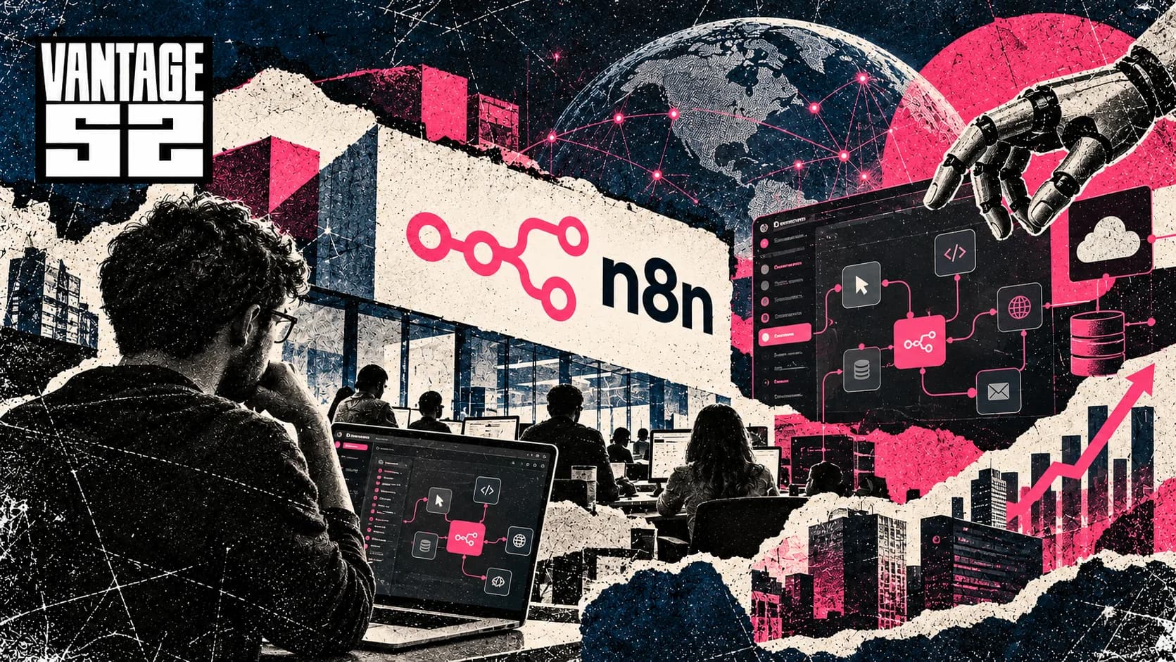
n8n offers a timely example. On 14 October 2026, the AI automation platform introduced a new visual identity at In The Loop, its first major conference, held in Berlin. The refresh includes a redesigned logo, a new typeface and a refined colour system built around the company’s signature pink. In a follow-up article published on 20 October, founder and CEO Jan Oberhauser explained how the changes relate to the platform’s evolution from workflow automation towards a broader environment for building workflows and AI agents.
The redesign arrives at a moment when the distinction between automation software and AI platforms is becoming less clear. Businesses are increasingly exploring systems that connect applications, interpret information, make decisions and take actions across different tools. For n8n, the challenge is to ensure that its brand reflects this expanded ambition while retaining the identity that made it recognisable to developers and automation professionals.
Why n8n Is Changing Its Brand
n8n began as a workflow automation tool built around connecting different applications and services. Its original logo reflected that proposition through a visual representation of connected nodes. The concept was straightforward and closely associated with how users created workflows within the platform.
As the product developed, the company’s ambitions expanded. Its platform now supports workflows involving AI models, agents, data and connected systems. In this environment, the value of automation increasingly lies in what happens between individual components, including how information is interpreted, how decisions are made and how actions are triggered.
The new logo reflects this shift in emphasis. Rather than focusing primarily on the connections between nodes, the updated identity seeks to represent the activity those connections make possible. According to n8n’s brand guidelines, the nodes have not disappeared altogether. The new symbol holds eight nodes and eight connection points in its negative space, a nod to the 8 in the company’s name. The distinction is subtle but strategically meaningful. It moves the visual narrative away from a specific interface concept and towards the broader capabilities of the platform.
This is an important consideration for technology brands. A visual identity developed around an early product feature can become restrictive as a company expands into new categories. If the brand remains too closely associated with its original functionality, customers may struggle to understand the wider proposition. A carefully considered refresh can communicate that evolution without requiring a complete break with the past.
From Workflow Automation to AI Orchestration
The wider context behind the redesign is n8n’s movement towards AI orchestration. Traditional workflow automation generally focuses on connecting systems and executing predefined sequences of actions. AI-enabled workflows can introduce additional capabilities, including interpreting unstructured information, responding to changing inputs and using models or agents to determine the next step in a process.
This evolution changes the way customers understand the product. The platform is no longer defined solely by the systems it connects, but also by the processes it enables organisations to build and operate.
For businesses, the distinction matters because AI adoption increasingly involves more than deploying an individual model. Organisations need to connect models with existing software, data and operational processes. They also need visibility, flexibility and control over how these systems behave.
n8n’s positioning around automation and AI orchestration places it within a growing market in which companies are seeking practical ways to integrate AI into everyday operations. The rebrand helps express that broader ambition, although the effectiveness of the positioning will ultimately depend on the product experience, customer adoption and the company’s ability to deliver on its promises.
What the New Visual Identity Communicates
The refreshed identity introduces three principal changes, a new logo, a new typeface and an updated colour system. The company’s signature pink remains central to the design, supported by a broader range of neutral tones intended to create greater flexibility across different applications.
The typography follows the same strategic logic as the logo. n8n operates in a technical environment, where clarity and precision are important, but its audience also includes people experimenting, building and sharing new ideas. The design seeks to balance a technical character with a more approachable personality.
This balance is particularly relevant for AI platforms. Their audiences range from experienced developers and technical teams to business users exploring automation for the first time. A brand that feels excessively technical may limit its appeal, while an identity that prioritises accessibility at the expense of credibility may struggle to communicate the complexity of the product.
A consistent visual system can help bridge that gap. It establishes recognisable design principles across the website, software interface, events and community experiences, allowing the brand to remain coherent as the product portfolio expands.
However, a new visual identity cannot establish market differentiation on its own. Its role is to make the company’s proposition easier to understand and remember. Product performance, usability, reliability and customer experience remain central to building a durable brand.
Why Brand Evolution Matters for Technology Companies
Technology companies often face a difficult branding decision as they grow. The identity that works well for an early product may no longer communicate the full scope of the business several years later. New product categories, different customer segments and changing market expectations can create a gap between what a company does and what its brand appears to represent.
Rebranding can help address that gap, but it also carries risks. A company may weaken familiar visual associations, create confusion among existing users or invest in a new identity without resolving the underlying positioning problem.
The most effective brand evolution begins with a strategic question rather than a design preference. What has changed about the business, its customers or its competitive environment? Which elements of the existing identity remain valuable, and which now restrict the company’s ability to communicate its direction?
n8n’s approach provides an illustration of continuity alongside change. The company is updating the way it presents itself while retaining its recognisable pink, its builder-focused community and its emphasis on connection, flexibility and control. The refresh is intended to extend the brand’s existing meaning rather than replace it entirely.
This distinction separates a strategic rebrand from a purely cosmetic redesign. The objective is to align the company’s external identity with the direction of its product and business while preserving the associations that customers already recognise.
The Role of Community in a Rebrand
n8n has also emphasised the role of its community in the rebranding process. According to the company, people from across the organisation contributed to the work, while community members reviewed early versions and provided feedback.
That involvement is relevant because technology brands are shaped by more than the products they sell. Developers, users, contributors and partners can become part of a brand’s identity through the tools they build, the knowledge they share and the communities they establish.
For a platform with an active builder ecosystem, a visual change can therefore carry meaning beyond aesthetics. Users may associate the existing logo with years of projects, tutorials, integrations and professional experience. A new identity must accommodate the company’s ambitions while respecting those established relationships.
Community participation does not guarantee universal acceptance. Some users may prefer the previous identity, while others may welcome the new direction. What matters strategically is whether the company communicates the reasons for the change clearly and maintains a credible relationship with the people who helped build its ecosystem.
n8n’s public explanation invites feedback and presents the refresh as another iteration of the company’s broader development process. That message connects the branding decision with the product philosophy the company says has guided its evolution.
A Rebrand as a Signal of Strategic Ambition
The significance of n8n’s refresh extends beyond its new logo. It reflects a company seeking to communicate a broader role in an AI market where automation, software integration and intelligent agents are becoming increasingly connected.
As AI platforms expand, brand positioning will play an important role in explaining what they offer, whom they serve and how they differ from competing solutions. Companies will need identities that can accommodate product development without becoming so broad that their core proposition loses clarity.
For n8n, the next test is whether the new identity helps customers understand its evolution and whether the product experience reinforces the promise behind the redesign. A stronger visual system can support recognition and communicate ambition, but long-term brand value depends on consistency between what a company says, what it delivers and how customers experience it.
The broader lesson for technology businesses is that rebranding works best when it reflects a genuine change in strategic direction. The objective is not simply to look different. It is to ensure that the brand remains relevant as the business changes.
n8n’s new identity marks an attempt to do precisely that, preserving the foundations of an established automation brand while preparing its visual language for a future increasingly shaped by AI agents, connected systems and more adaptive forms of automation.
Tags
Key Concepts
Sources
Where the reporting above comes from. Follow these to check the figures and statements for yourself.
- n8n Blog, Why we refreshed the n8n brand Jan Oberhauser explains the new logo, typeface and refined pink colour system introduced at In The Loop on 14 October.
- n8n Community, Our brand refresh, and why the logo changed Founder and CEO Jan Oberhauser tells the community why the old node-based logo was replaced and how the refresh was developed.
- n8n, n8n Brand System Official brand guidelines covering the refreshed logo, colour palette and typography.
- n8n Brand System, Logo Describes the new symbol, with eight nodes and eight connection points in its negative space as a nod to the 8 in n8n.
- n8n, In The Loop 2026 Official page for n8n’s first major conference, held on 13 and 14 October 2026 at Wilhelm Studios in Berlin.
- n8n Press Company facts confirming Jan Oberhauser as founder and CEO and n8n’s positioning as an AI orchestration platform.
- GitHub, n8n-io/n8n pull request 40342, Update UI with n8n rebrand Code change merged the day before the launch that brought the new brand colours, logos and design tokens into the n8n editor.